In collaboration with in-house and external teams, we unified two parts for the business for a better customer experience and increase in engagement.
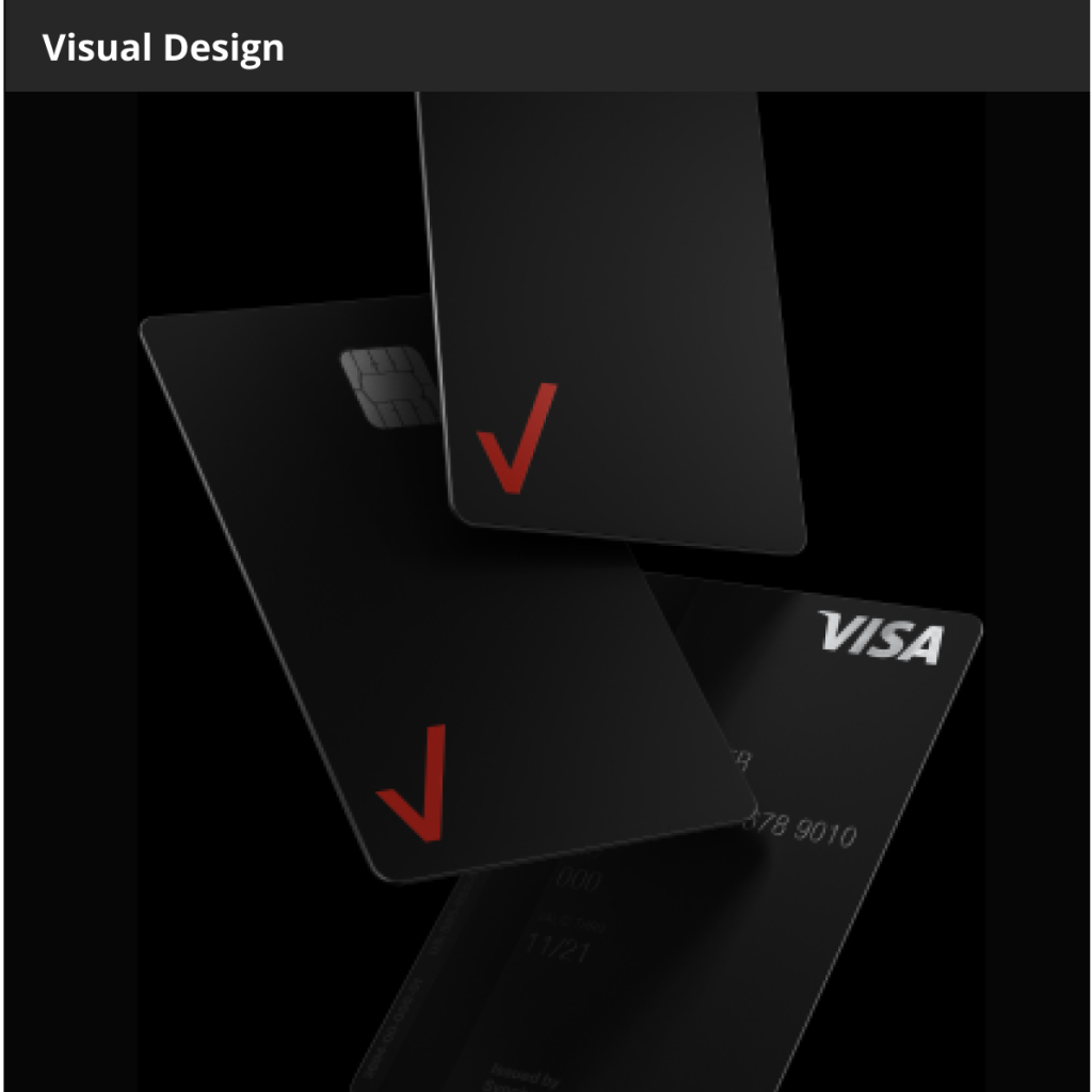
Client—Verizon
Agency—in-house
Role—Visual Designer
TIME— 4 WEEKS
Goal
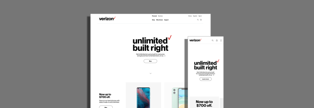
Verizon Wireless and Fios Home Internet/5G Home Internet are two different entities. The goal was for these two parts of the business to live on a singular home page for a unified experience.
My role
My team worked the visual design of the new Verizon homepage and shop page. With data and insights provided, we created new design components. Incorporating the new design systems provided by the in-house experience team, these new components would served as the new standard for future Verizon pages.
Approach
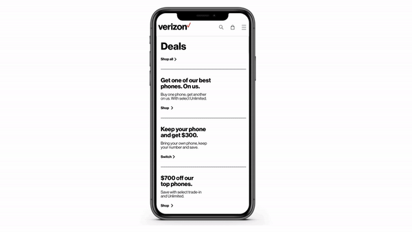
Using the mobile-first approach, we aimed to radically simplify the experience. In collaboration with the in-house experience team and external agencies, the navigation was simplified and we used data to inform the content, layout and hierarchy of the updated homepage.
Outcome
The simplified layout proved to be successful. By eliminating a lot of the “noise” and focusing on making it easier for users to engage with content. The initial rollout was to 10% of user but because of the success it was fully throttled earlier than expected. A simpler experience resulted in 16% increased page engagement and 12% increase of users moving into the shopping flow.

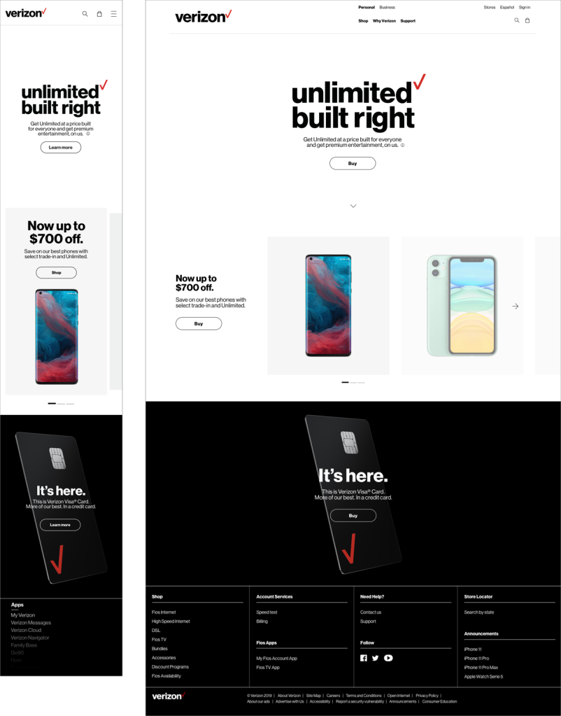
A Simple Narrative
In an attempt to increase engagement and reduce the amount of content the user is shown, the content was cut down to the newest/latest stuff. This allowed for the new global navigation to work harder for the customer that was searching for something in particular.
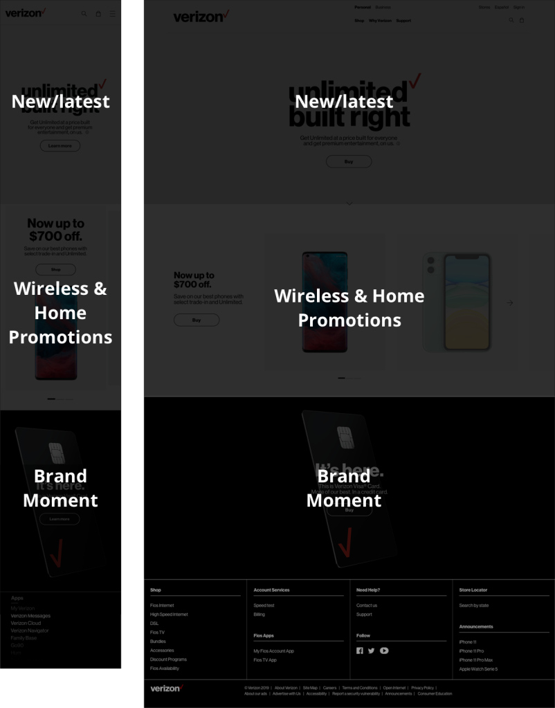
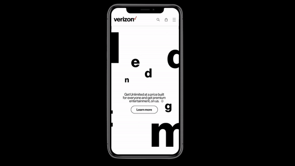
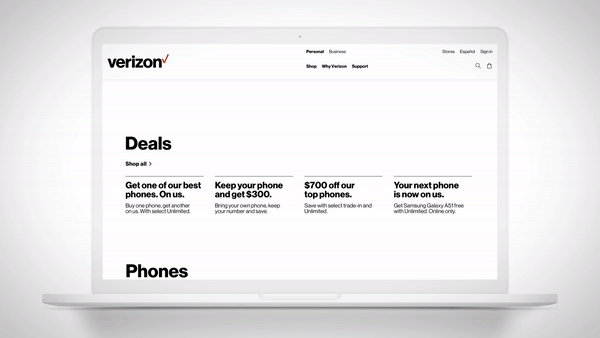
Visual Design
As industry data shows that in 2016 mobile internet usage surpassed desktop usage, we design mobile-first in order to create an optimal mobile experience. In this new homepage era, microanimations are an new added element which helps the page look fresh and elevates the look and feel.
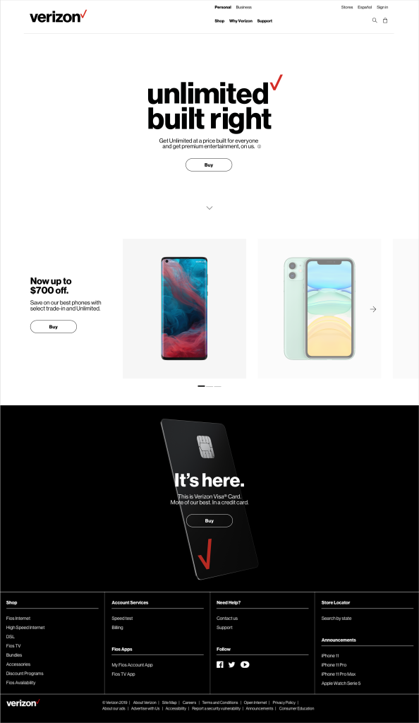
Shop page
For the shop page, we wanted to kept it very utilitarian and functional. Taking wayfinding into consideration, we categorized the products by kind to encourage easy browsing. We opted to use promo text pods that lived on the previous homepage since they performed well and prioritized the latest promos in first position.
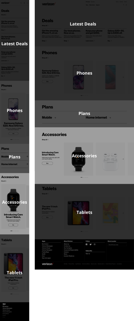
Prototype
By keeping similar patterns, users can easily and quickly browse through products, promos and plans.

Redesign Timeline
I’ve been apart of two hompepage redesigns during my four years at Verizon. It’s always an exciting experience to keep evolving.
2016
When I first joined Verizon we had colorful icons for navigation, lots of red accents and lots of promos living in a hero carousel.
2018
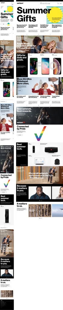
After about a year and a half, I was apart of the homepage redesign team. Here we opted for a more modular layout that allowed us to easily swap out content while also taking the narrative into consideration. We also eliminated use of carousels as much as we could in efforts to have most content exposed. This also made for a very long page.
2020
This time around it was exciting to apply previous learnings into evolving and improving the 2020 version of the new Verizon homepage. Also, unifying two parts of the business added an interesting and unique challenge.
Final Thoughts
This project was one of my favorites to work on. Being able to collaborate with different people was cool and seeing how it all came together from a design, business and experience perspective. It’s a great to success to have been able to simplify the homepage experience and for it to not only be received in such a positive way but also perform well.