About
Chelsea Piers App helps users explore and register for sports classes, drop-in activities and view fitness class schedules. The goal was to update the outdated UI and simplify the sign-up for classes flow by allowing for a personalized feed.
Process

Empathize (Research)

Competitor analysis
While selecting competitors, other gym facilities were taken into consideration.

Key Takeaways

Market Segmentation
Locals (geographical) who frequently use (behavioral) the Chelsea Piers Fitness app.
Interviews
The users interviewed ranged from very active to moderately active (24-35). I set out to set aside my assumptions and find out what a user needs from a fitness app

Interview Findings
Users were split between having an active gym membership and not, but preferred group fitness classes because it keeps them motivated. Frustrations with other apps include inaccurate lists of classes, access to class/training information
Define

Personas
Through personas, new opportunities emerged. By immersing into each user’s experience, more pain points surfaced.

Problem
Competitors analysis and interviews were helpful but negative app reviews served as useful insight as well. Common painpoints that emerged were outdated ui, class scheduling, and class info.


Solution
As Chelsea Piers has an overwhelming amount of activities and events to attend. The solution would be for each user to have their own curated feeds by personalizing their account during onboarding. In addition, will also create a seamless, intuitive way to sign up for a class/event. Lastly, update the outdated UI.

Site map
The first set of features revolve around onboarding and class signup. Site map shows where class info page lives.

Task flows
There are 2 task flows. The first one is user onboarding and the second one is signing up for a class. There are two ways a user can sign up for a class. Either through activity or calendar view.

Ideate/Prototype

Wireframes

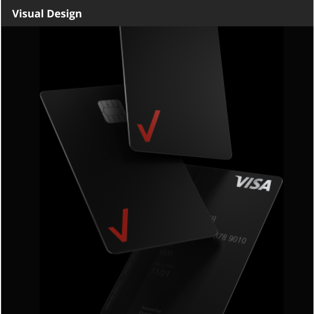
Visual Design/Design system
One of the pain points was the UI, the task was to update the visual design of the app. Chose a more open and welcoming font to replace the previously condensed typeface. Kept the same color of the existing logo and accompanying tones. Additionally, adding a shade of yellow as an accent.

Personalized feed
In order to create a personalize experienced, the user is presented with a series of questions to be able to curate events activities that the user is more into.

Onboarding
Here the user creates an account with the app by selecting activities that are of interest.
Sign-up for class
This feature allows the user to seamlessly sign up for a class based on a curated feed created based off the onboarding.

Activity view
This view allows the user to view a curated list of activities they can browse. Once a user finds activity they’re interested in, then they can select which time they want to participate.

Calendar View
This view is for users that are more interested in searching for an activity that best suit their schedule. This view lists activities in order of time.

Calendar reminder
Once the user signs up for a class, a calendar reminder will live in the first position of their feed.
Final Thoughts
I found that early prototyping helped imagine how things would move/transition and through that exercise I was able to identify other hiccups that went unnoticed in a static comp. The onboarding process was really interesting. Thinking about how to engage the user before they are even in the app itself. Giving them the option to be able to use the app to its fullest potential by personalization and guiding them easily through it step by step but also always giving them a way out or the option to skip.
Other Work