Client —U.S. Bank
Agency — Hero Digital
Time— 8 Months
Role—Senior Designer
Overview
U.S. Bank is a company that provides banking, investment, mortgage, trust, and payment services products to individuals, businesses, governmental entities, and other financial institutions.
Card Central their internal tool used by bankers. It is a critical resource for everything credit card-related. It ranks in the top 5 internal U.S. Bank sites and is a pivotal tool to drive card conversations in the branches.
Full Case Study (Coming Soon…)
Goal
The goal is to increase the sign-up rate for credit cards from 65% to 75% through banker-led customer engagement.
Problem
The problem is low engagement with the instructional videos and supportive resources. These resources are crucial in equipping bankers with the necessary knowledge to persuade customers to enroll for a credit card.
Objective
Drive more bankers to the Knowledge Hub where they can access educational videos that provide tips for improving credit card enrollment strategies.
Create more opportunities for bankers to engage, interact and contribute.
My role
Lead design by integrating industry best practices with a client-centered approach.
Approach
Understand business requirements and make incremental updates to the experience based on banker needs. Work closely with development to best understand platform limitations.
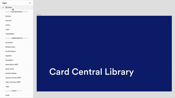
Establish Design system
Conducted an audit of Card Central’s content to help identify opportunities for enhancing user experience, build a design system, understand patterns, and create components.
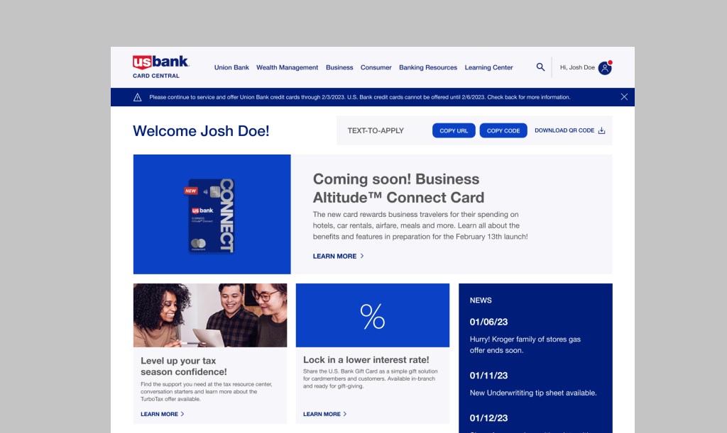
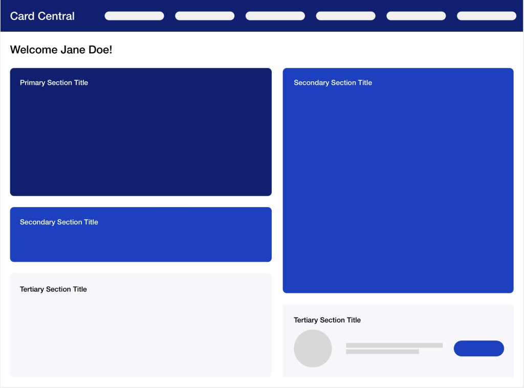
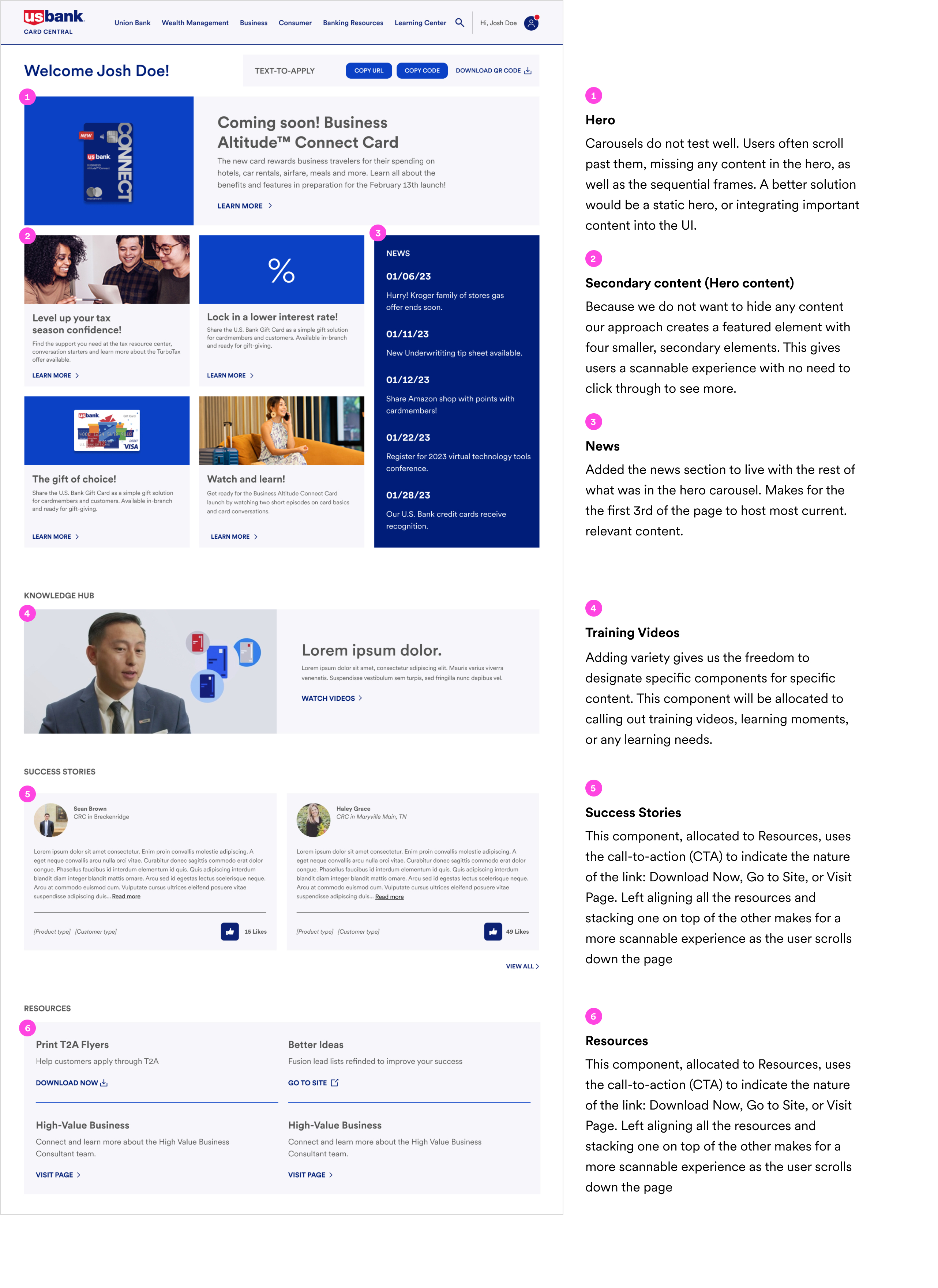
1. Improve Visual Hierarchy (Homepage)
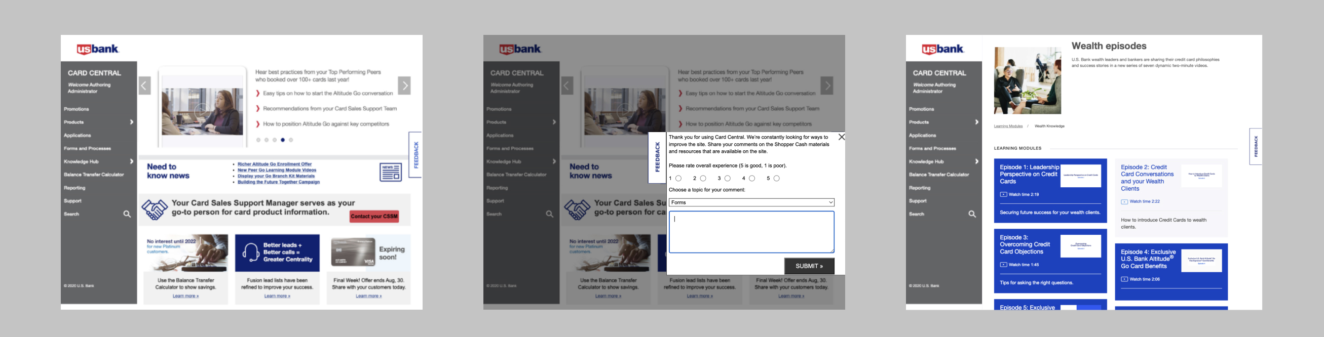
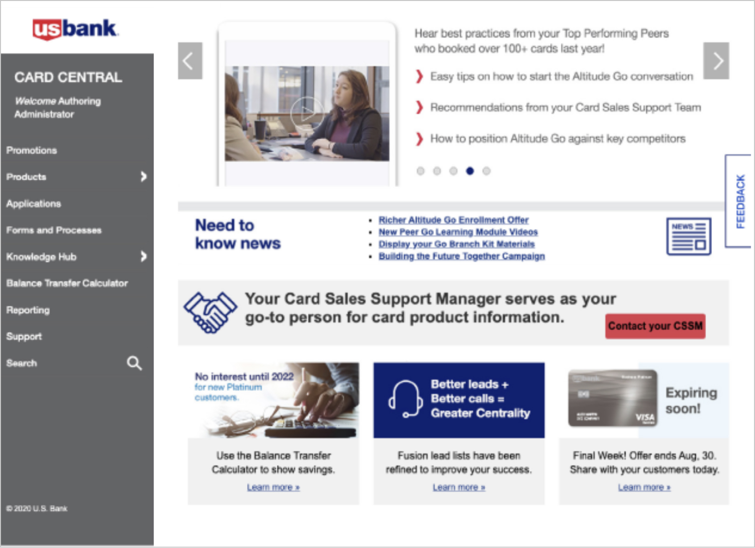
The previous homepage was cluttered, creating a cramped appearance without clear content hierarchy. Content was hidden behind a carousel and there was no evident call to action.
Opportunity
Update Navigation Orientation
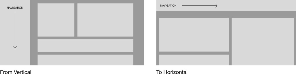
Since we’re limited to a 1132px width, changing the navigation orientation from vertical to horizontal allows for better use of the space and emphasizes the desired content, enhancing readability.
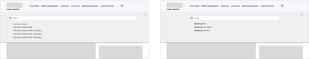
Predictive Search
Introduce a predictive search tool to help users find relevant results faster. This will also include a list of trending or common searches.
Improve Visual Hierarchy
To give bankers a more scannable and scrollable experience, we set out to improve the hierarchy of content on the site by creating distinct components for specific content types, making it easier for bankers to navigate through information.
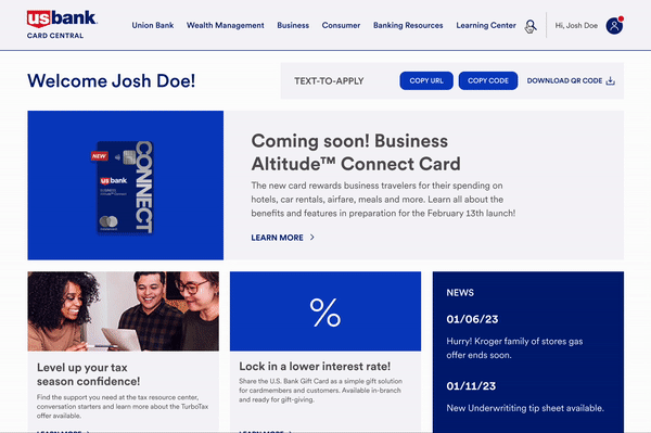
Updated homepage
Task flow 1: Use predictive search to navigate to Knowledge Hub

Hompage
Navigate to Knowledge Hub from Homepage
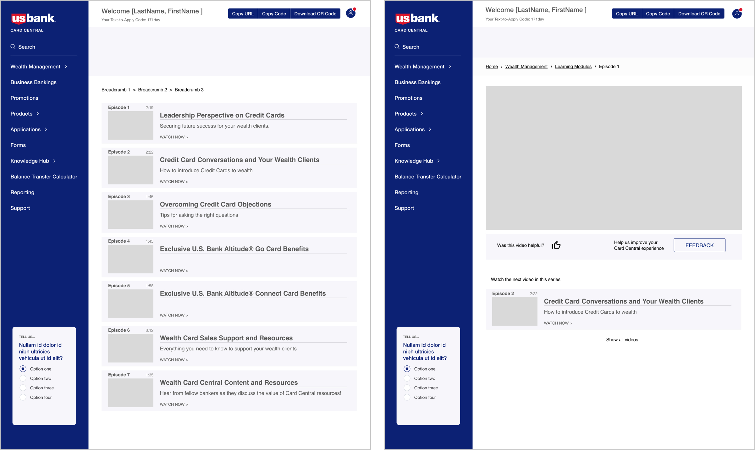
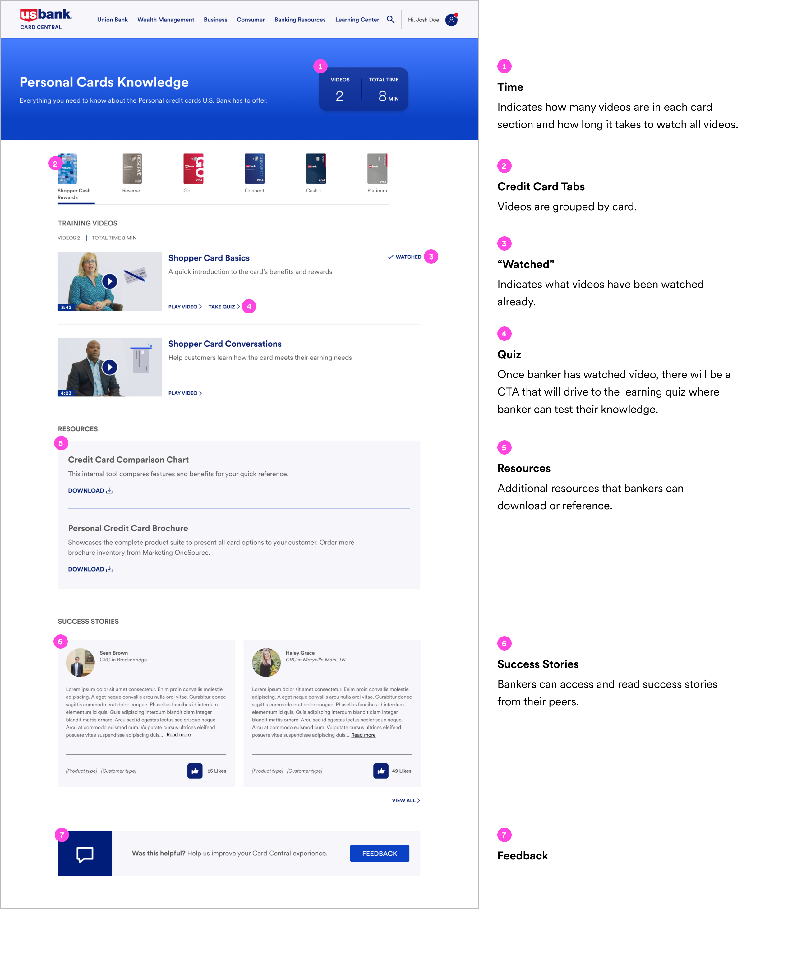
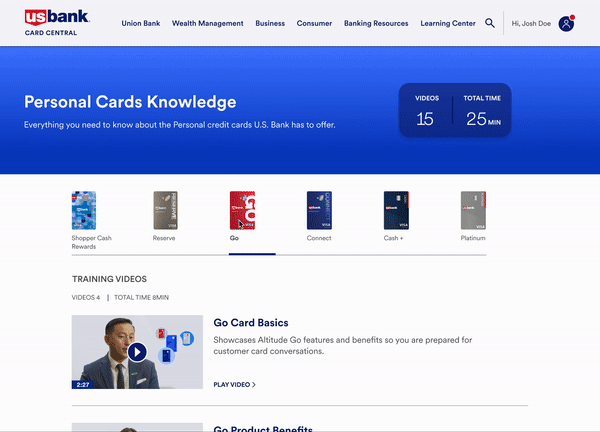
2. Redesign Knowledge Hub
The Knowledge Hub is where bankers can access learning videos. Previous layout is not easily scannable.
The video page is a dead end moment within the user’s journey. Banker is not provided with a next step in the learning journey.
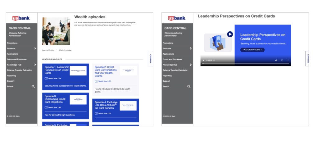
Opportunity
Serve up training tools in a fresh and relevant way to increase views. Provide next steps or more help resources to keep banker engaged.
Learning Videos
Enhance the layout of the Knowledge Hub by designing a scannable list of videos that allows bankers to quickly see the information about each episode and if they have already watched an episode. Adding suggested next steps simplifies the process to further engagement to watch additional videos and or browse other resources.
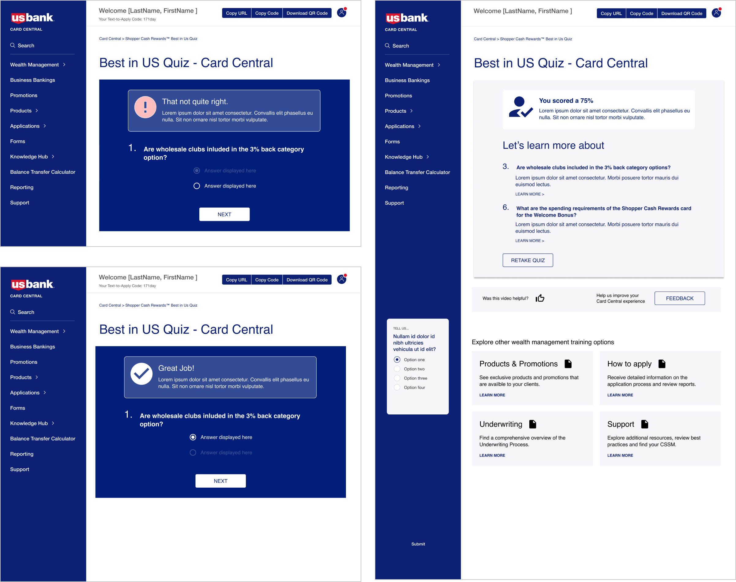
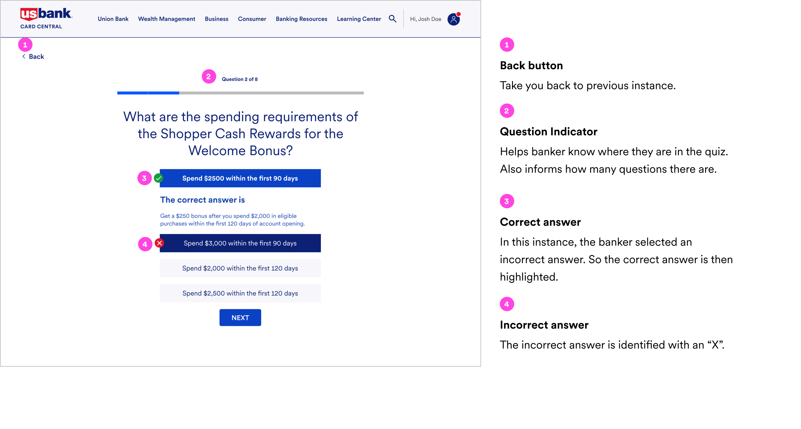
Quiz
Introducing a quiz for bankers promotes greater engagement, and the subsequent result page provides them with additional relevant information to deepen their understanding.
Redesigned Knowledge Hub
Quiz
Quiz Result Page
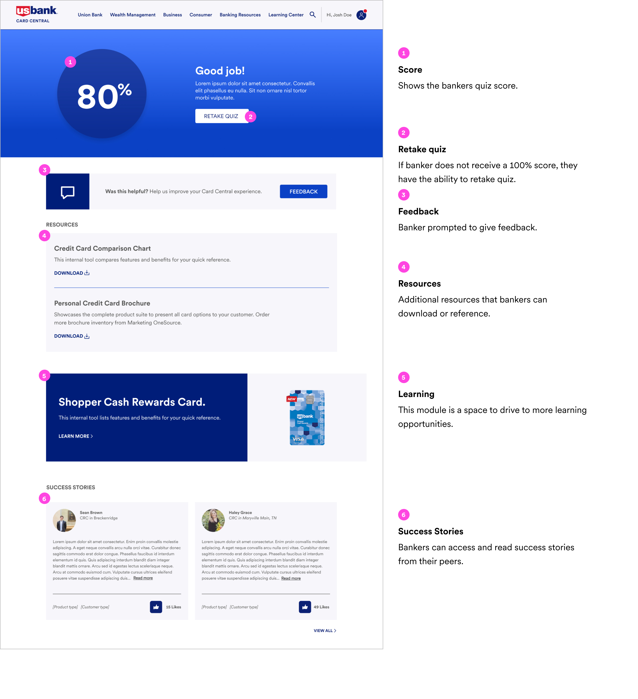
Task flow 2: Watch video and take quiz and see quiz results

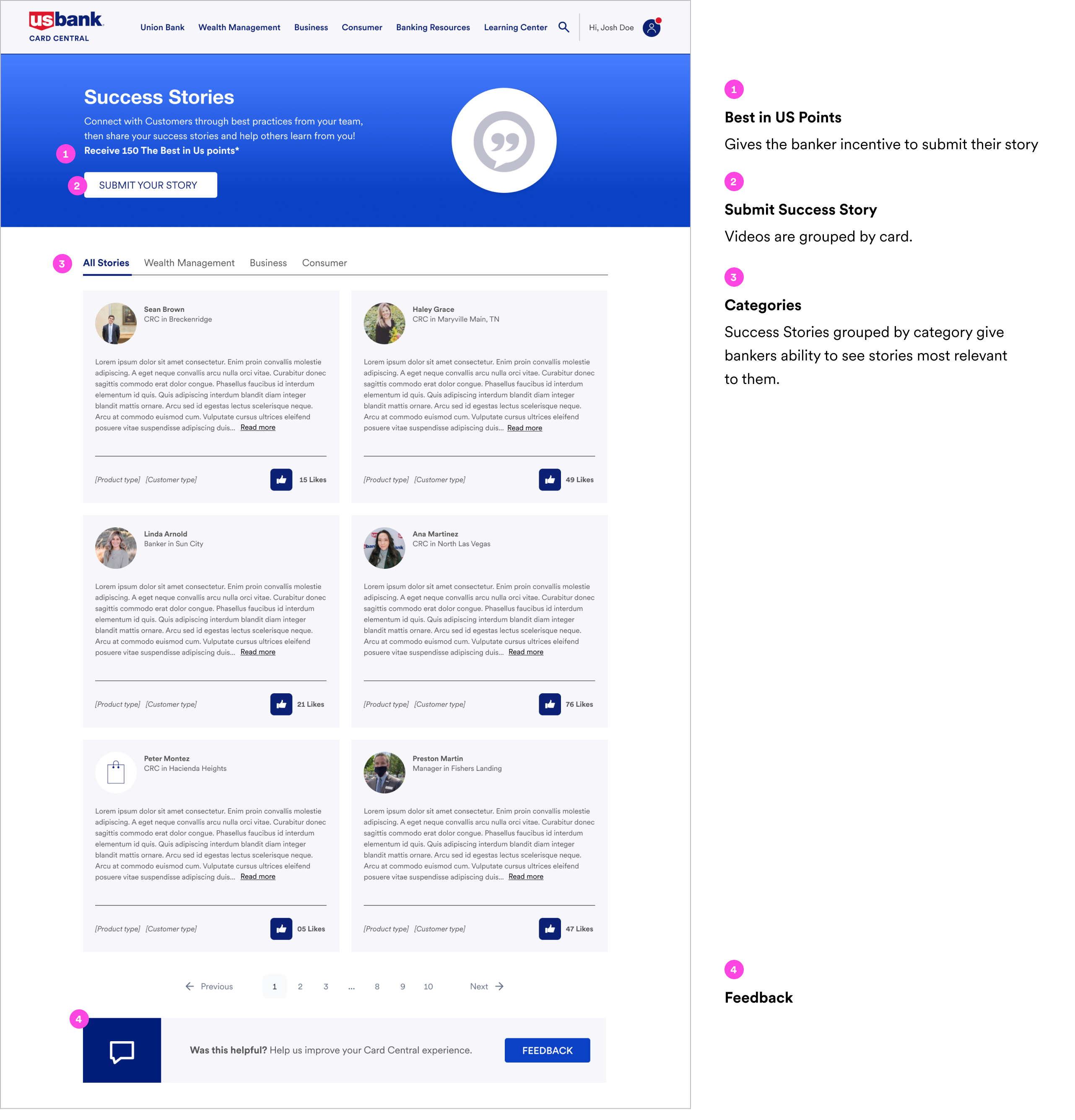
3. Success story & Feedback
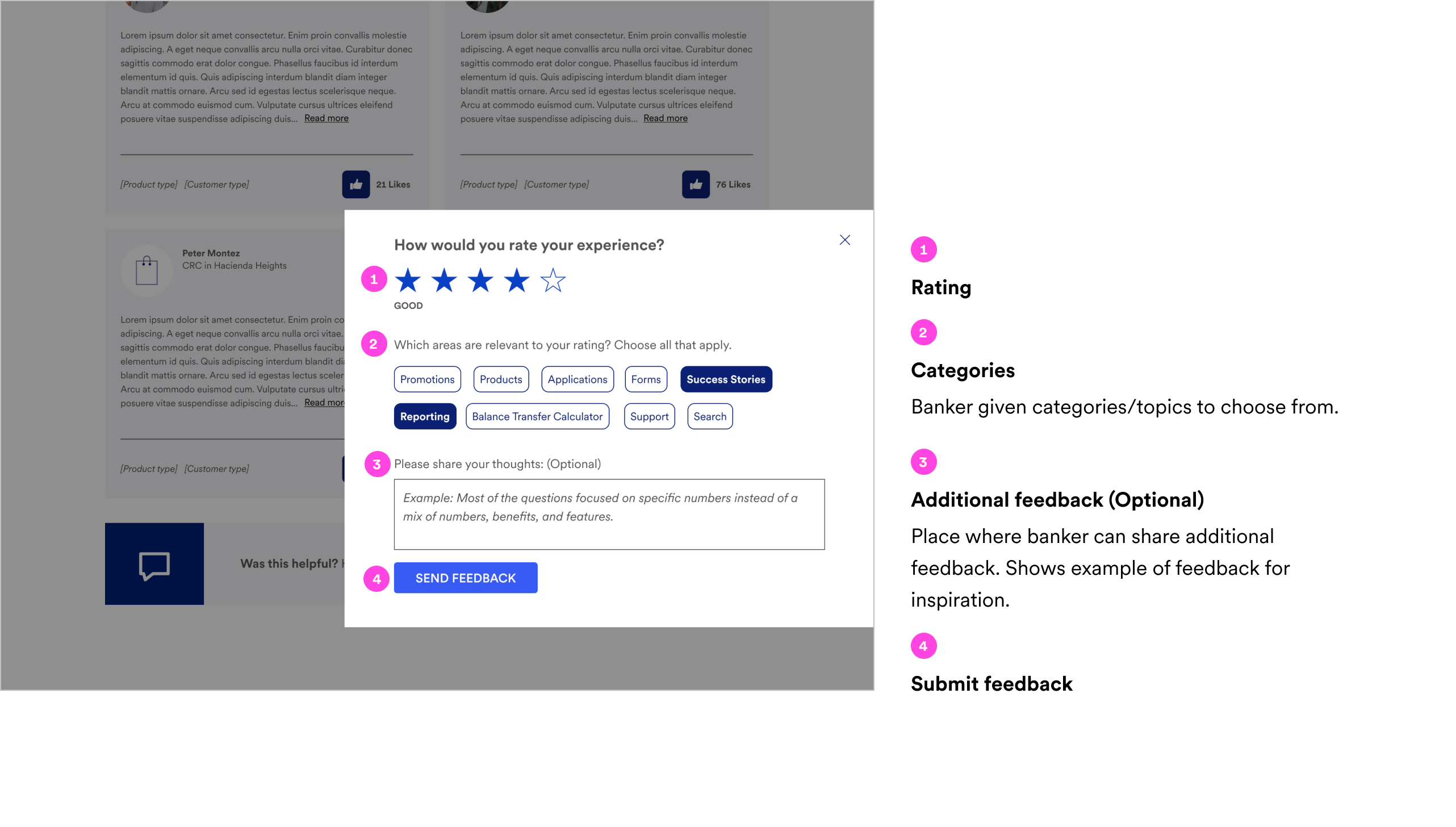
Inspired by testimonials & customer reviews, we introduced a forum where they can share Success Stories with their peers to promote engagement and collaboration among bankers. Additionally, we enhanced the feedback system for Card Central to improve the collection of feedback from bankers regarding the site.
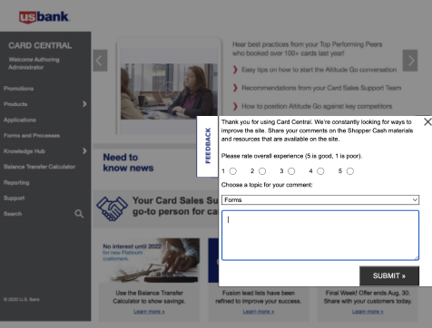
Streamline the feedback process by offering pre-populated words for one-click feedback, reducing cognitive load and making it easier for bankers to provide their input.
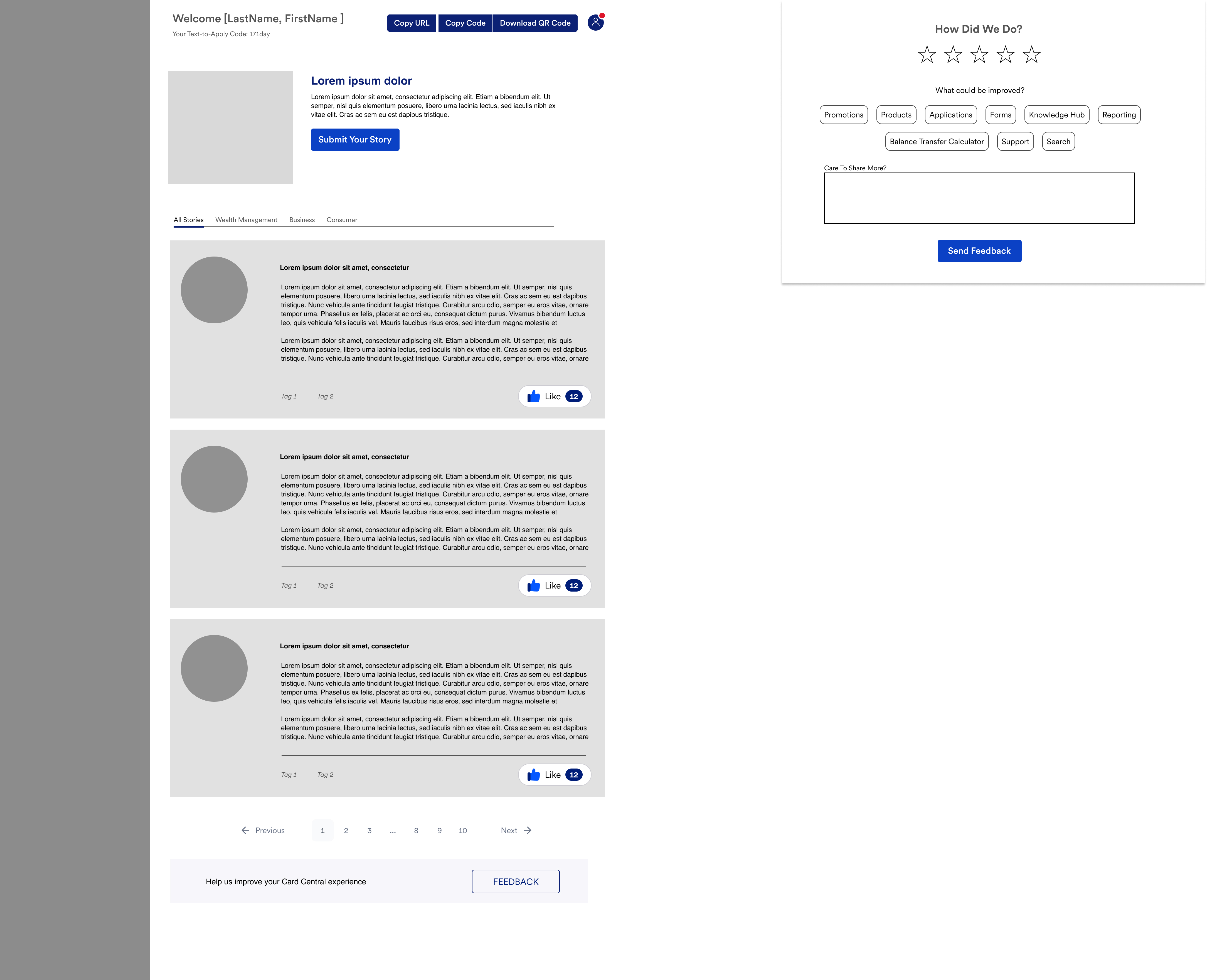
Task flow 3: Provide feedback on Success Stories

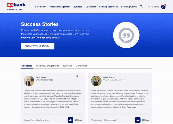
Success Stories
Updated Feedback
Success stories & Feedback
Post your success story and provide feedback
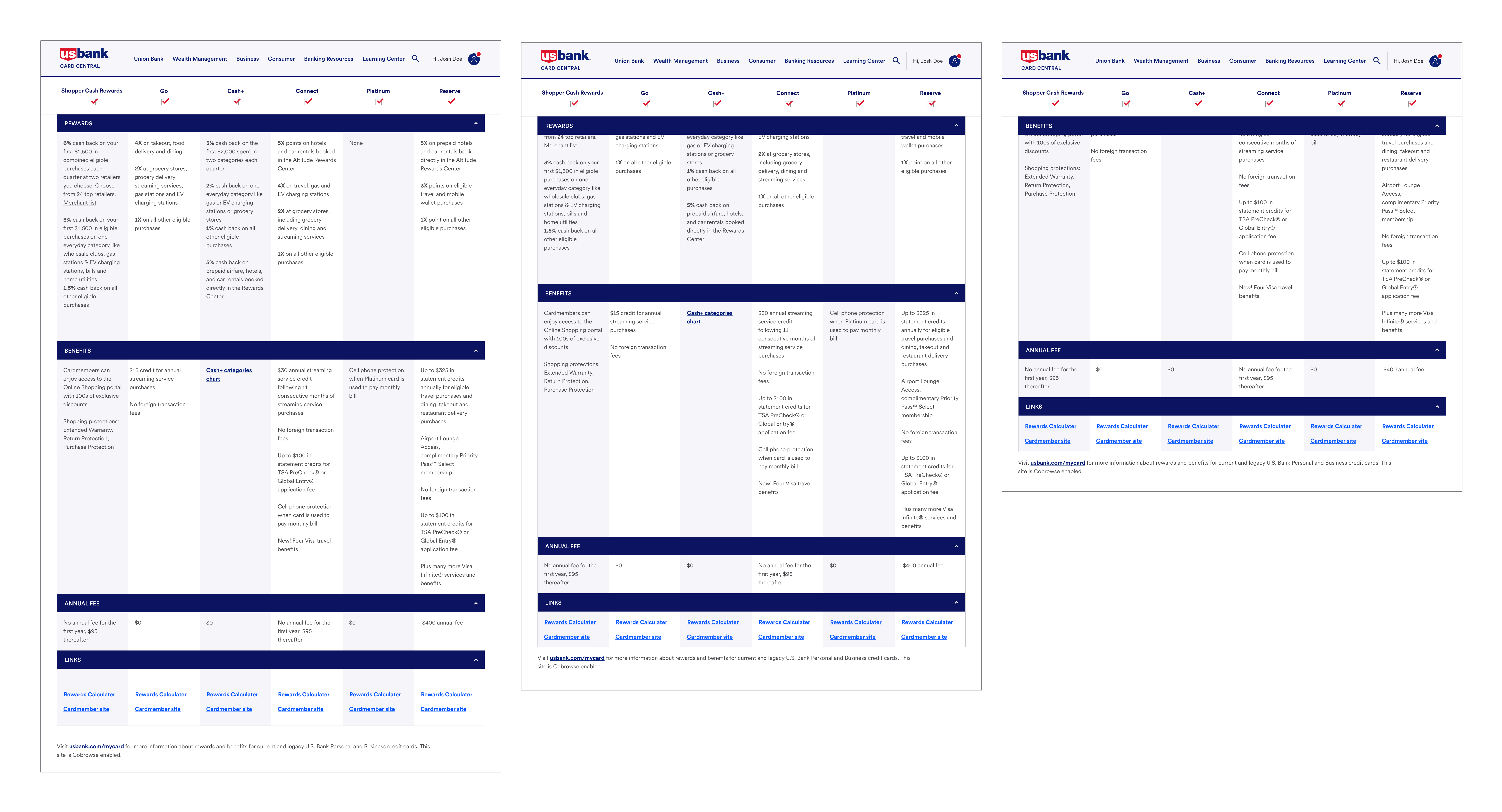
4. Improve Card Comparison Update
There was a need to improve the Card Comparison chart. Bankers requested the ability to be able to compare specific cards side by side, which the current static experience was missing.
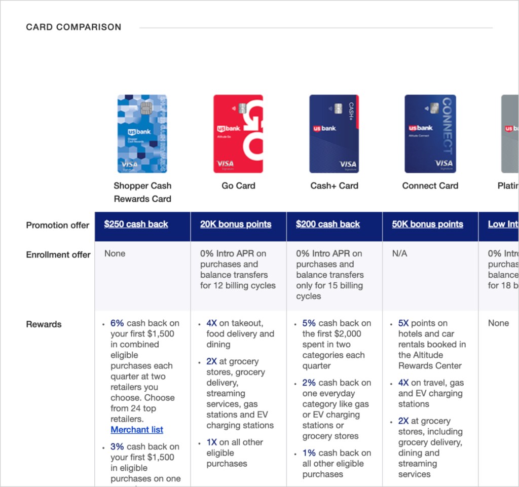
Opportunity
Because of limited capabilities we were unable to change much of the layout so we focused on enhancing the functionality. Banker is able to compare specific a cards side by side by selecting/deselecting. Introducing accordions for each category also allows for further comparison.
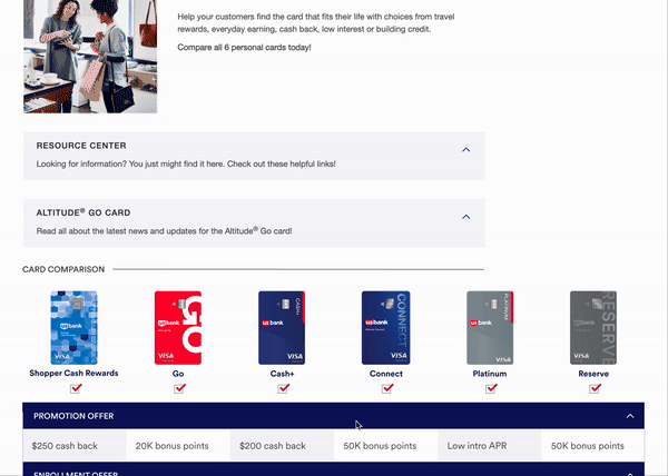
Sticky nav
For the banker not to lose their place in the chart, the card selection bar remains sticky as the user scrolls as well as the category.
Final Thoughts
I really enjoyed being apart of this team and iteratively improve the Card Central experience. As usual, the collaboration with different disciplines is my favorite part to ensure that as a team we’re able to enhance the experience from all angles. For the business and for the bankers.