Building an experience to guide people living with heart disease and those who support them on the journey of accepting, implanting, and living with a heart device
Client —Medtronic
Agency — Hero Digital
Time— 4 months
Role—Senior UX/UI Designer
Overview
Medtronic is a global producer of medical devices. Best known for its revolutionary cardiac devices, like pacemakers, it also has introduced cutting-edge products into the industry.
Goal
The primary goal is to connect patients and caregivers with straightforward information about their condition, with the aim of subsequently decreasing the number of calls to the call center.
Problem
Users are overwhelmed with an a lot of information due to poorly organized content, leading to a high volume of calls to the call center.
Solution
Redesign the Heart Device Answers page into an engaging experience centered around the patient. Empower users throughout their emotional and physical heart care journey by providing timely information and effectively addressing their questions.
My Role
I utilized the research provided by the UX researcher to shape the designs. I presented and explained these designs to clients, actively incorporating and applying their feedback. The insights gathered and shared by the researcher played a pivotal role in organizing content and guiding the design decisions. As a senior designer, I collaborated directly with the director of UX, product manager, visual designer, and the front-end development team. Additionally, I contributed to supporting the UX team/lead, marking my initial involvement in a UX project.
Process
The Design Thinking process was used for this project. It is effective in finding real problems so that we could focus on seamlessly useful solutions.

Empathize
User interviews
I observed as the research team conducted interviews. In an effort to gain a better understanding of the patient’s needs, the team interviewed the client to draw additional insights from both their research and their experience with the company.
Key Takeaways
• Focus on patient first as a user.
• Understand the needs of the patient.
• Walk patient through journey.
• Arrange content to be easily understandable.
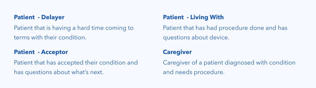
Target Audience
Patients in different stages of their journey and a small focus on caregivers.
Comparative analysis
Conducted from a functionality and journey perspective, a comparative analysis helped determine what features or elements to incorporate in order to enhance the experience.
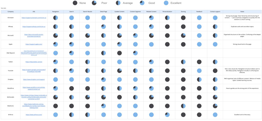
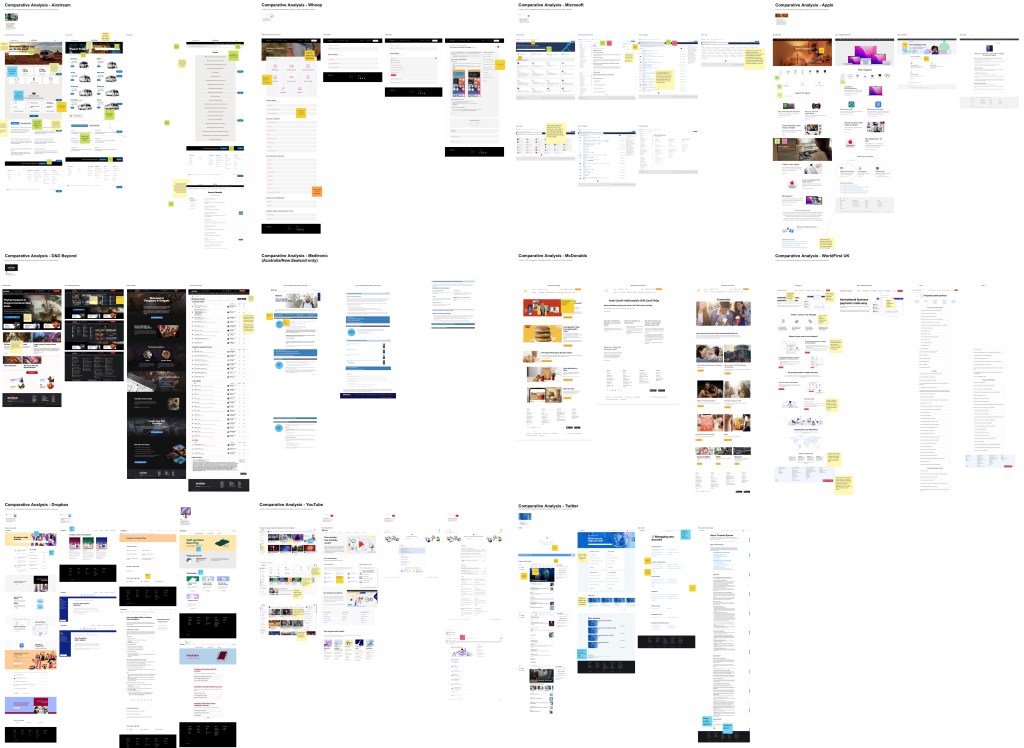
Key Takeaways
• Make search field the primary focal point
• Organize content by category and help type
• Divide content into buckets allowing user to pick what is right for them
• Filterable results page
Define
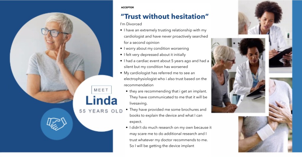
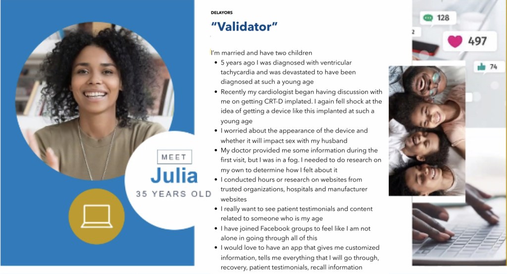
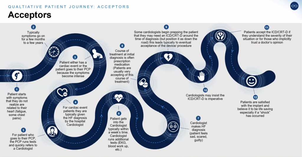
Personas & User Journey
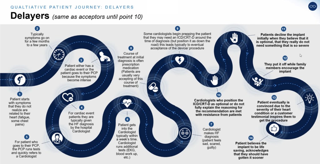
Personas and User Journey was provided by the research team. From here we were able to pull some insights on how the patient feels from symptoms to procedure to living with device. Which helped define the “Moments” in the user’s journey.
Key Takeaways
The key takeaway from this was understanding how the patient feels before even knowing their diagnosis. Which helps in understanding how the patient is worried or overwhelmed with emotions by the time they come to the site to seek for answers. This helped direct the design to be more simple and less overwhelming with welcoming visuals and imagery. This also helped identify the steps in “Moments”
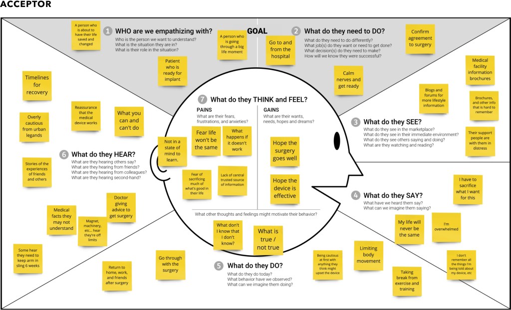
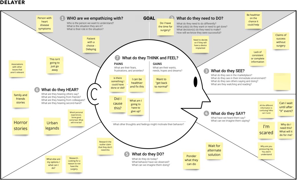
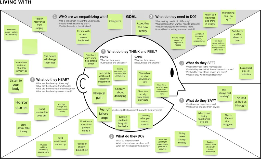
Empathy Map
The Empathy Maps were particularly important in order to understand the emotional rollercoaster patients embark on during their diagnosis.
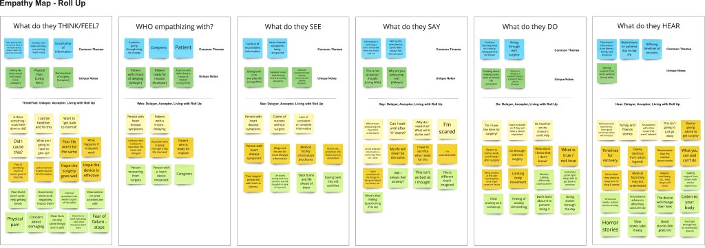
Key Takeaways
• Users feel uncertain and confused.
• Users feel they’re presented with a surplus of inconsistent information.
• Users feel nervous about the surgery and live after the procedure.
Design
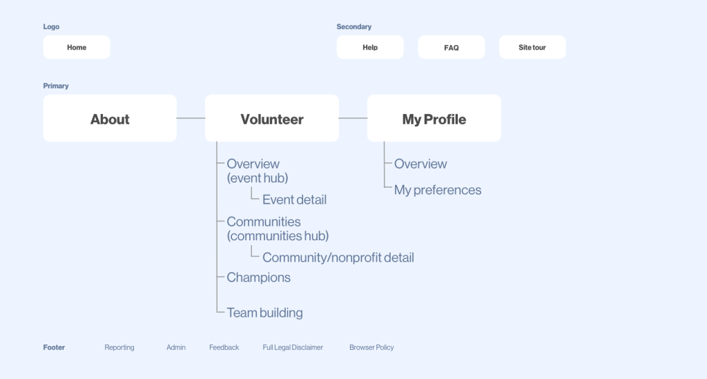
Information Architecture and Site Map
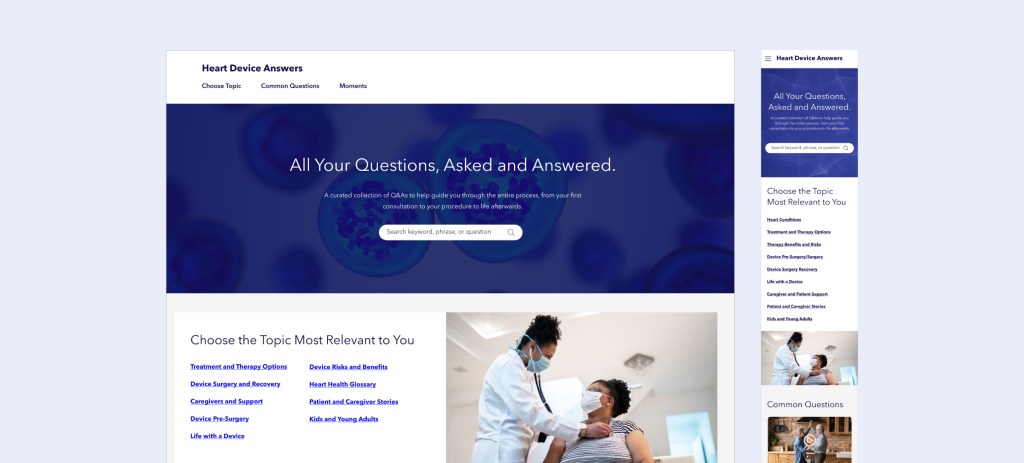
In efforts to simplify the site and move away from the overwhelming wall of content, the site was organized in 3 buckets. Topics, Common Questions, and Moments – visualized below.
Wires
Layout begins to take shape during wireframing.
Hi-fidelity
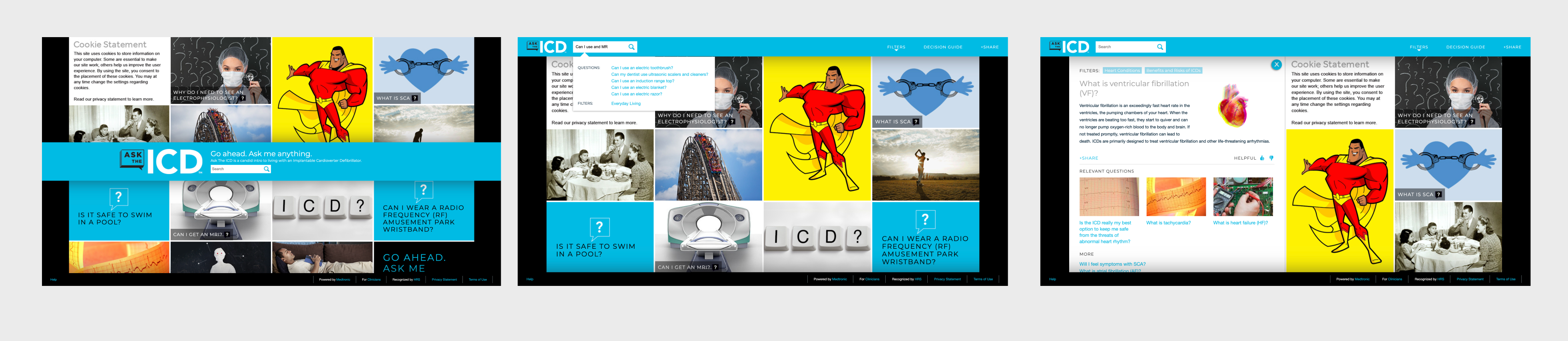
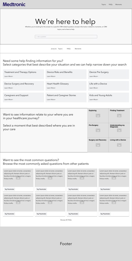
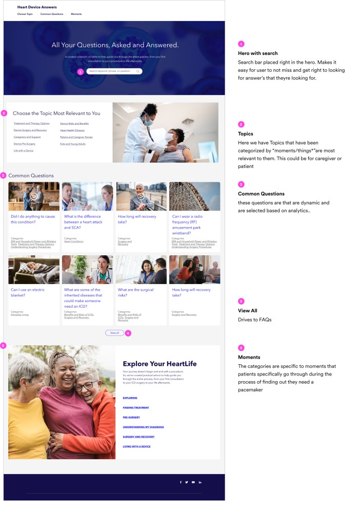
Homepage – Desktop
The content was organized by Topics, Common Questions, and Moments.
Topics : Different categories relevant to caregivers and patients.
Common Questions : Based on FAQs pulled from analytics.
Moments : Are the different milestones on the patients journey.
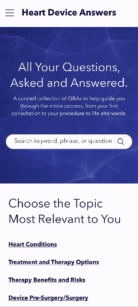
Mobile
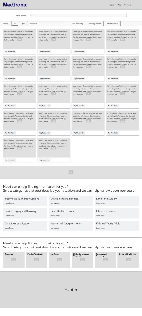
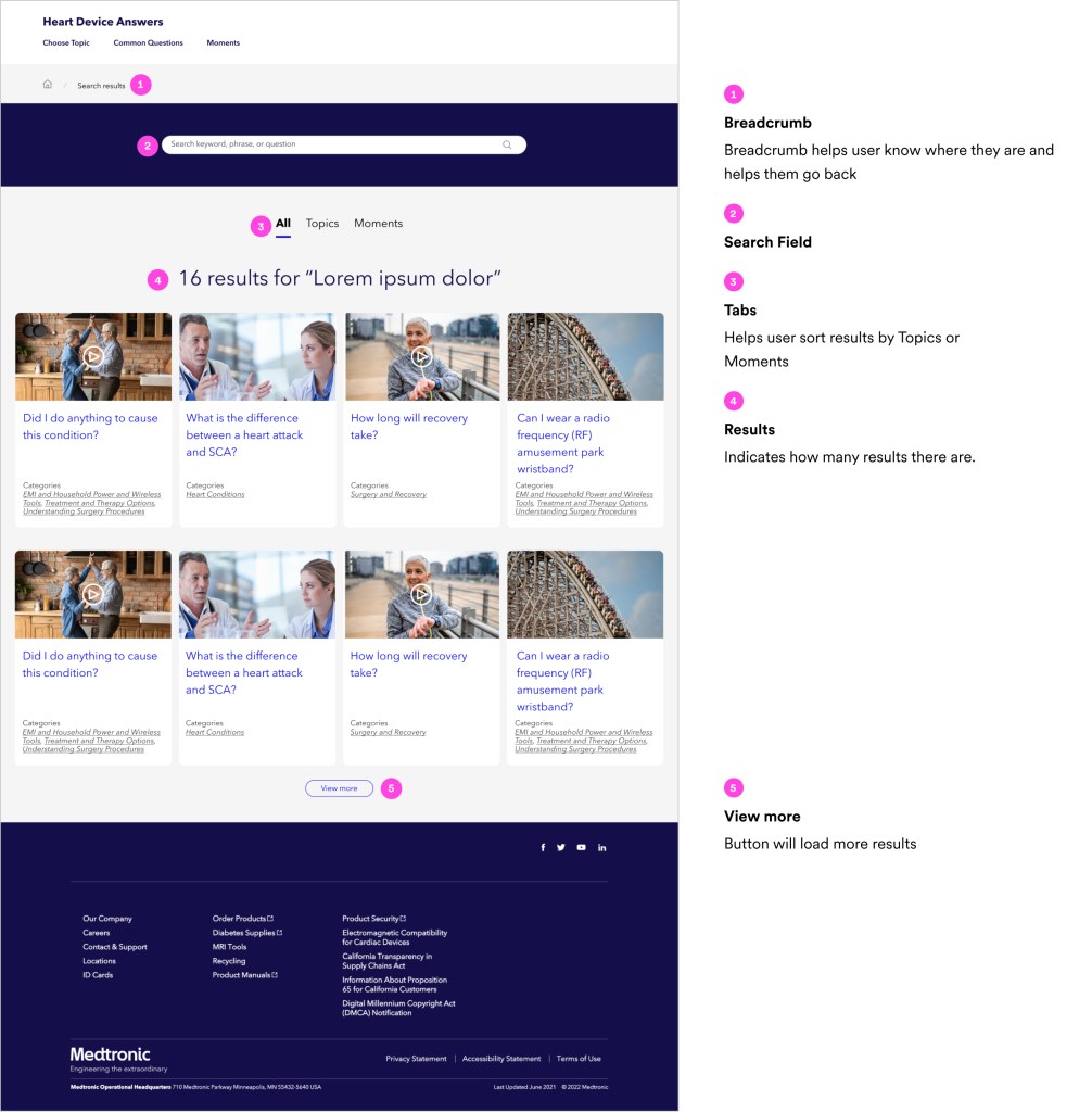
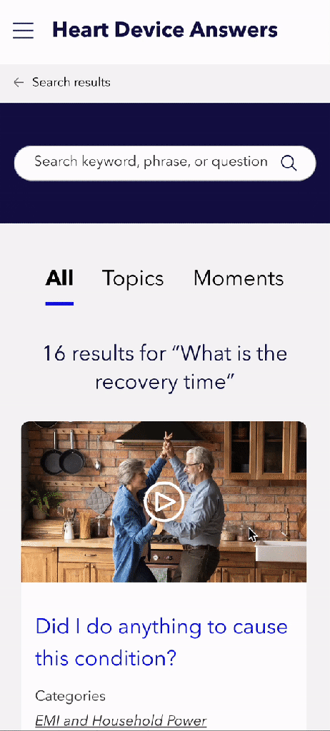
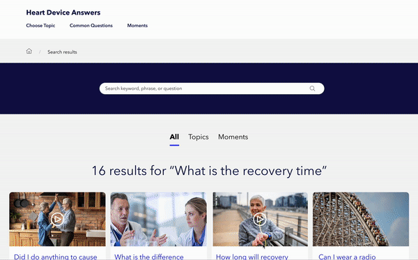
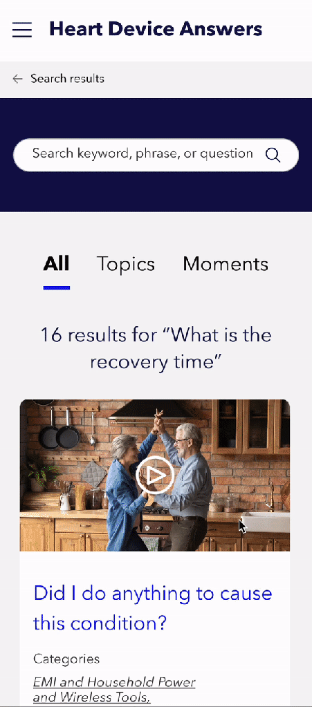
Search results – Desktop
When the user enters a searches term or phrase, the first 8 results will populate on a Search Results page.
Mobile
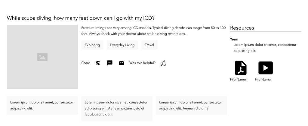
Answer modal
To keep user on the Search Results page, the answer will be revealed in a modal. The modal will also have 3 additional related questions and to ability to download or share answer.
Mobile
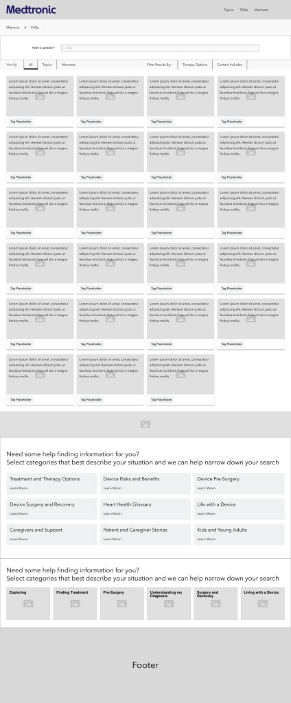
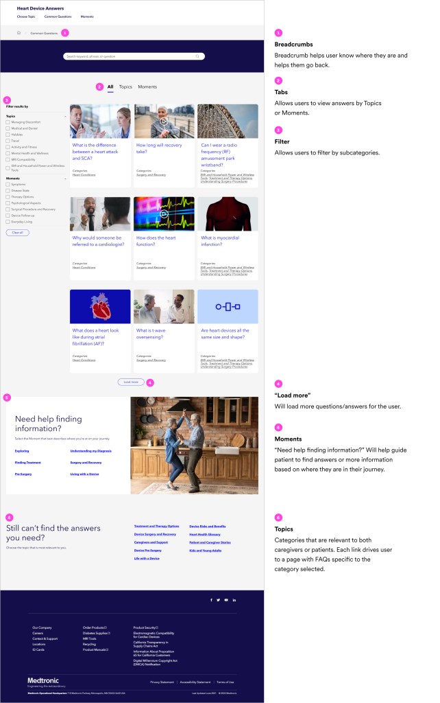
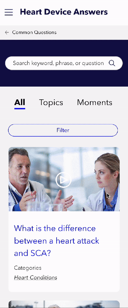
Common Questions page
All the frequently asked questions (FAQs) live on the Common Questions page. The user has the ability to sort through questions/answer by Topics and Moments. Questions and answers can also be filter by subcategory.
Mobile
Final Thoughts
I really enjoyed the process from ideation, design, testing to development of this project. Couldn’t have done so without the amazing team at Fave!